Establishing legendary boldness: how Visit Rapid City crafted an authentic brand story with Simpleview creative services
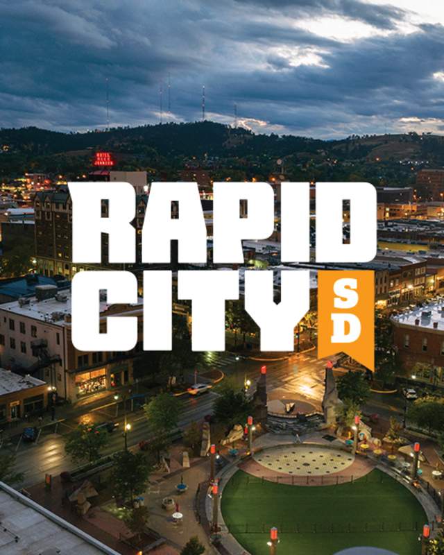
“Legendary boldness”— two words that define not only Rapid City, South Dakota, as a destination, but now its new visual identity as well. From the destination’s cultural background to its nature-centered wonders, Rapid City defines what it means to be bold and distinguishable. Visit Rapid City, the destination marketing organization (DMO), needed a way to visually define its destination through authentic storytelling and strong design elements.
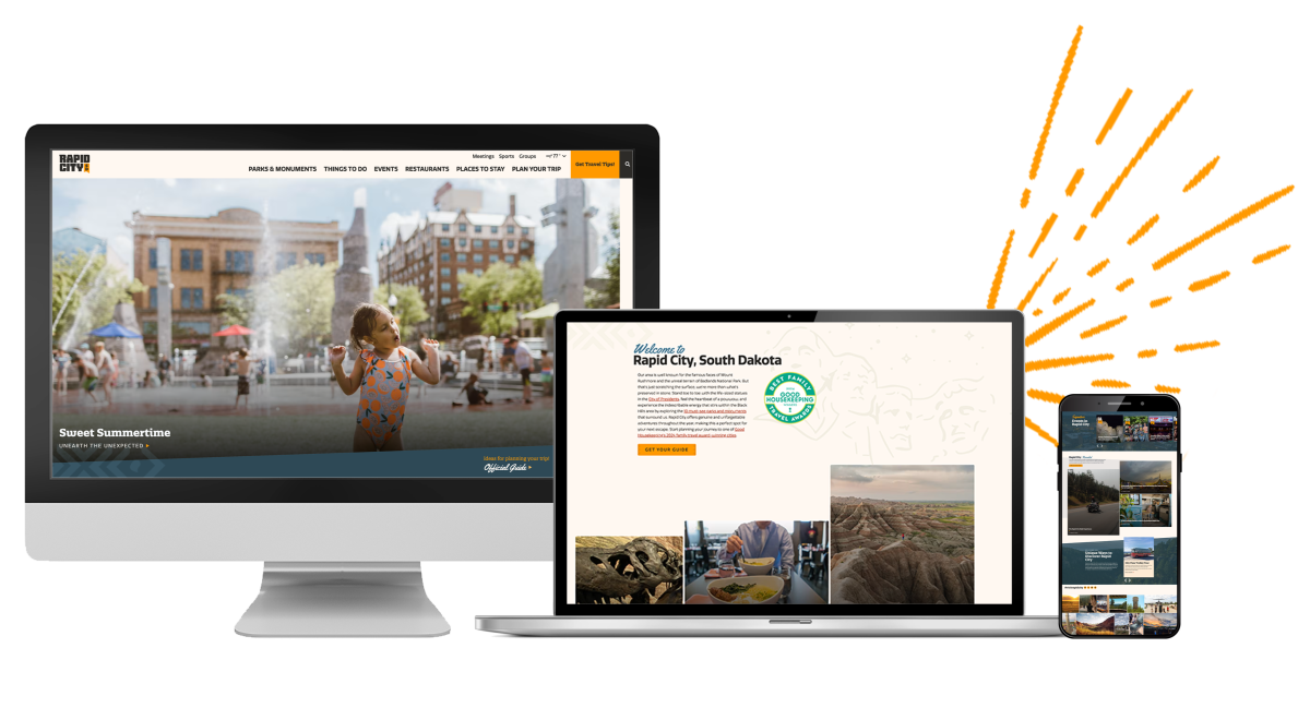
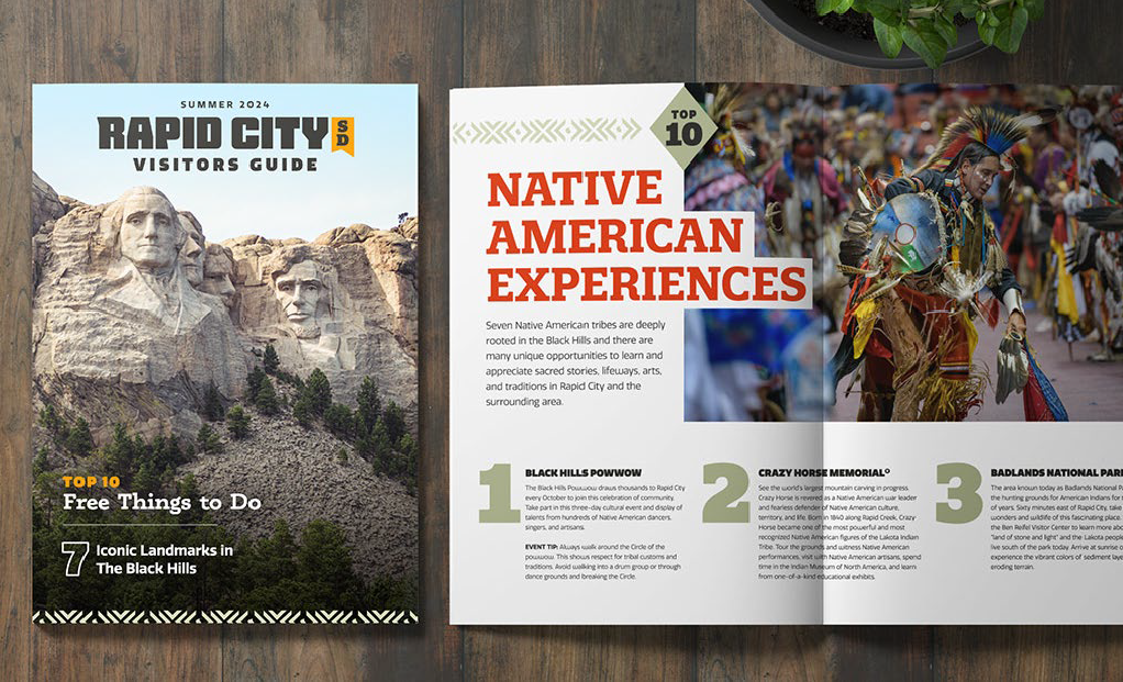
From the newly launched website, powered by Simpleview CMS, to Rapid City Visitor Center — the destination is now covered in adaptations of a new logo, color palette, and fonts — with even more to come.
Visit Rapid City sought to create a synergy between its identity as a destination and how it was portrayed to visitors and locals. The goals of the project included:
- Implementing a flexible and adaptable website that was easy to use and that didn’t look “cookie cutter”
- Brand the destination with a logo that would stand out from nearby communities, yet remain cohesive with well-known parks surrounding them
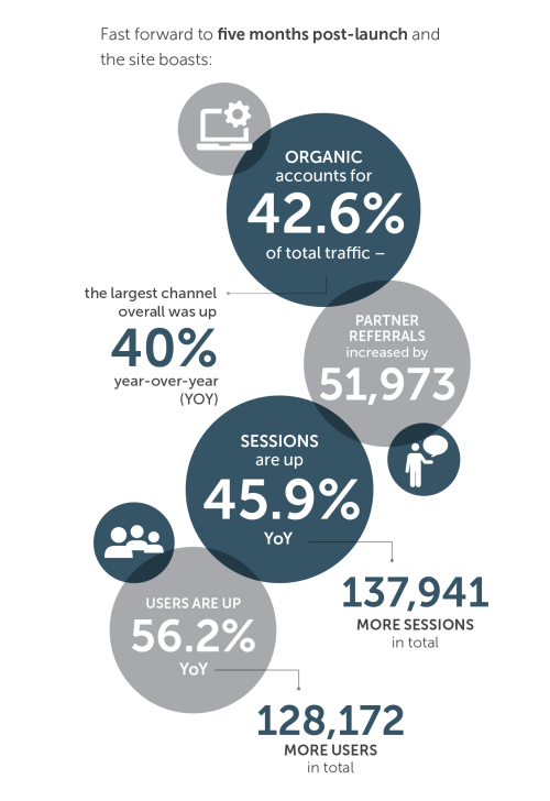
- Increase website metrics including sessions, users, time on site, and conversions
- Modernize the approach to the brand to better represent indigenous culture and the destination’s history
The DMO also intended to implement search engine optimization (SEO) and paid media once the new visual identity was in place to help support its key performance indicators (KPIs) — such as garnering requests for proposals (RFPs), getting newsletter sign-ups, and visitor guide orders.
Visit Rapid City — Spirit of Progression
Visit Rapid City faced multiple challenges in addressing its current brand identity. Its previous brand was nearly 10 years old; the former logo prominently featured Mount Rushmore, which limited the team’s creativity when creating marketing collateral, campaigns, and swag.
In the spirit of progression, the removal of the significant monument once featured in the logo allowed space for Visit Rapid City to better represent indigenous culture and the destination’s rich history throughout its narrative.
“Our current brand was not progressive and we struggled with adapting it to our needs as a DMO,” said Dani Benne, Director of Marketing at Visit Rapid City. “Rapid City needed a bold new face, and our team was in search of an agency that could make that happen without missing the mark.”
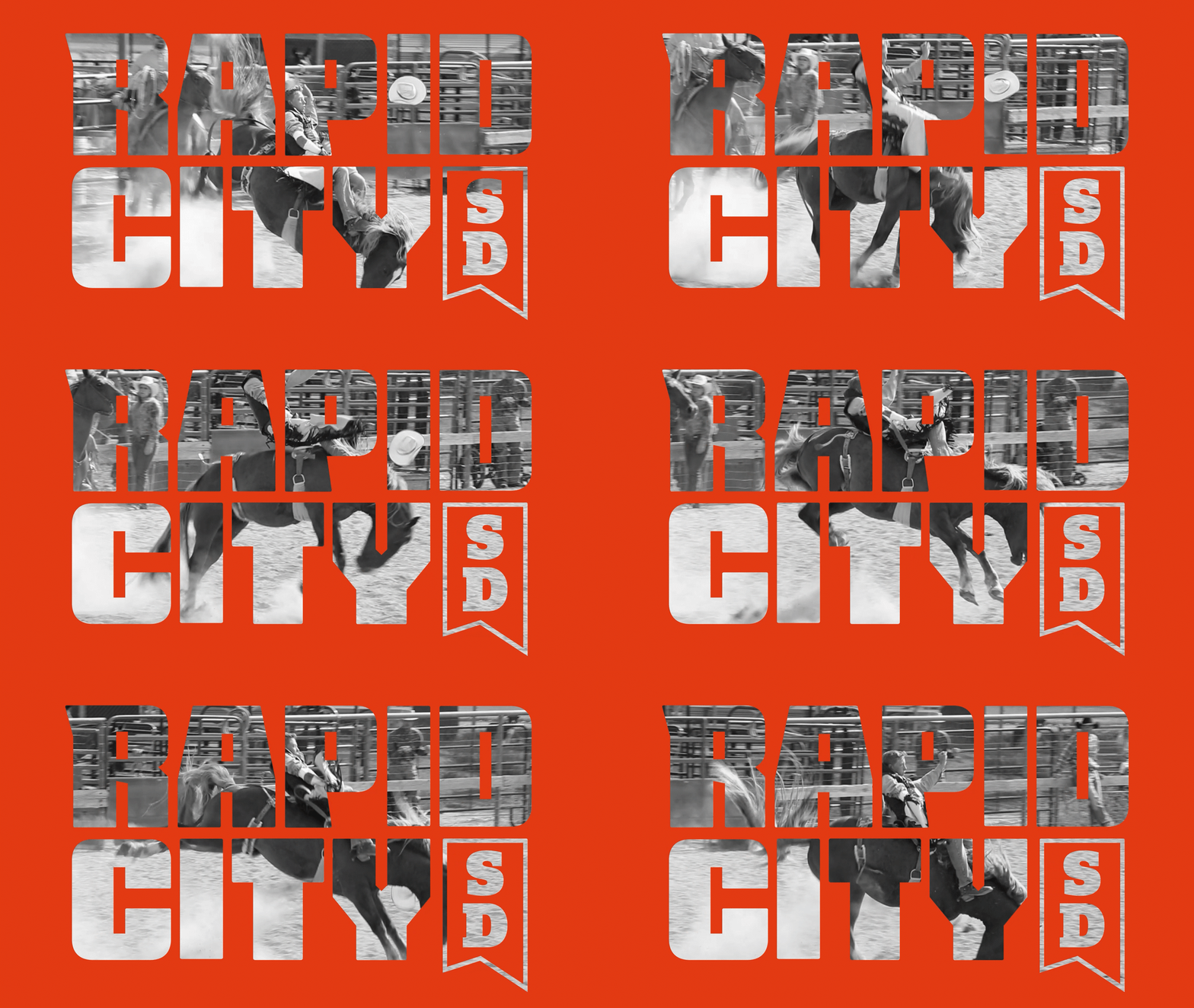
Legendary Boldness
Rapid City's Personality
-
Pioneer Spirit
-
Family Friendly
-
Affordable
-
Authentic
-
Charming
-
Clean & Safe
-
Sacred
-
Energizing
Destination Attributes
-
Historic Significance
-
Untamed & Iconic
-
Magnetic
-
Memorable
-
Hub & Spoke
Ease of access to 10 must-visit parks and monuments
The Brand Solution
Already using the management power of Simpleview CRM, Visit Rapid City felt set up for success when choosing the right experts to take on its visual identity and website redesign project. With the DMO’s goals in mind, Simpleview’s creative services team defined the visual narrative for Visit Rapid City through a destination immersion and a discovery meeting where members of the Simpleview team spent a few days nestled in the core of the destination — soaking up every sight, sound, and story it could offer.

Simpleview was really easy to work with and so personable which can be tough to find in a larger agency.”
During the destination immersion visit, the Simpleview creative services team identified the following:
- A review of the current visual identity
- Goals for the new branding and redesign
- The purpose, mission, positioning, value proposition, and elevator pitch
- Rapid City’s personality: Past, present, and future
- Strategic planning initiatives and a competitor landscape
- The DMO’s target audience
These pieces helped define the destination’s attributes and visual guidelines that would help drive design direction.
“The immersion was an ingenious way to discover Rapid City at its depths,” said Benne. “Visiting the destination first was essential to the success of our new identity.”
Simpleview took to the drawing board, creating a visual representation of what Rapid City, South Dakota, looked like to potential visitors, in-market travelers, and its locals.
Visual Preferences
- Bold
No blending with others - Strong
Stand in total confidence and authority - Avoid Clichés
No snow capped mountains, avoid common "earthy" colors, overly western - Distinguishable
Easily identifiable and not mistaken for other communities
Visual Identity Pillars
- Memorable
Builds credibility, desirability, and notoriety - Authentic & Unique
True to who you are, unique amongst competitors - Relevant
Contemporary, connects with the audience - Adaptive
Works in all use-cases - Identify
Build something that identifies, not explains
Visit Rapid City's New Identity
A new website, designed with legendary boldness in mind.
The new brand has inspired the team and our stakeholders; it captures how we want to communicate with our visitors. It also helps set the expectation of what you get when you’re in Rapid City … a bold, unforgettable experience."
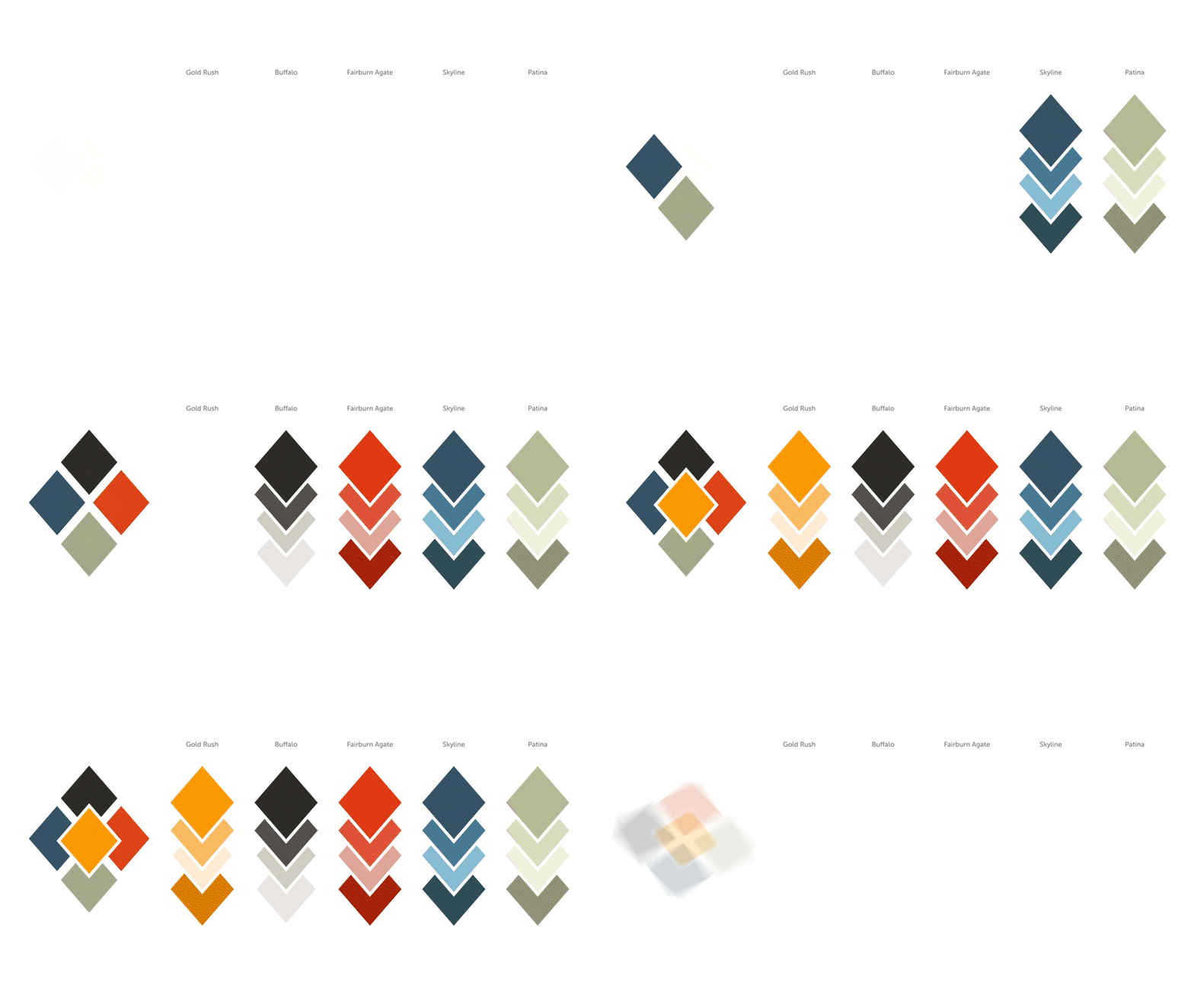
From Personality Comes Color & Mood
A Color Palette to Set the Tone
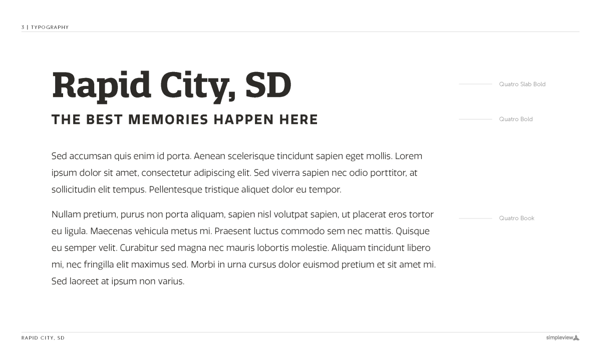
Topping it Off with Typography
In destination branding, every decision is deliberate. The Simpleview XD team has two typography rules it refuses to break:

When choosing editorial fonts, the goal was for them to be tasteful, a bit sophisticated, and compatible with the logo fonts.

Legibility overrides everything when choosing editorial fonts: if you’re putting words on the website, you want people to read them—there’s no room for clutter simply for the sake of cleverness.
Logo fonts and editorial fonts have two different purposes, and never the two shall mix.
A Bold Identity Emerges
The fruit of the labor of this redesign project is seen through the following elements:
- A captivating new logo
- A stunning and cohesive new visual identity that gains awareness for visitors and is adopted and adapted into other destination organizations within the city

The new visual identity provided a connection to the Visit Rapid City brand’s equity — adding value for its partners and the destination as a whole. The DMO continues to take advantage of additional Simpleview offerings, integrations, and partnerships — like advancing its RFP presence with SendSites and enhancing its new website with SEO. The team at Visit Rapid City also ensures accessibility is top of mind on its new website by using AudioEye — an industry-leading digital accessibility platform.

Need help telling your destination’s story?
Give your destination the visual identity it deserves. Greet and inspire visitors, attendees, and partners with an evoking identity through branding and design.
Let's Talk Design
