For the first time in 50 years, the San Mateo County/Silicon Valley Convention and Visitors Bureau (CVB) embarked on a major destination rebranding. The Peninsula region of the San Francisco Bay Area lies immediately south of San Francisco, reaching from its famous neighbor to the north into the high-tech Silicon Valley enclave.
The destination marketing organization (DMO) had trusted Simpleview as its technology company for years. That trust and familiarity gave it the confidence to hire Simpleview to help reimagine its brand.
The rebranding challenge San Mateo faced: with San Francisco always stealing the tourism spotlight, how could the area carve out an independent identity in its own right?
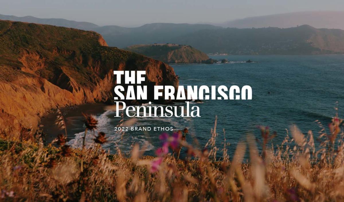
Introducing ... The San Francisco Peninsula
The discovery process was a blend of creativity grounded in data. Working with a market research firm that conducted stakeholder interviews and traveler surveys, the Simpleview team immersed itself in the destination, exploring its abundant natural assets and gathering inspiration.
While graced with both scenic beauty and the excitement of a cosmopolitan community, it quickly became apparent that San Mateo County suffered from a lack of place identity. While everyone knows where San Francisco is, few could place its neighbor to the south.
When Simpleview’s experience design (XD) team test-marketed a few name variations, The San Francisco Peninsula won by a long shot because it immediately grounds the region with a sense of place. The San Mateo County & Silicon Valley CVB agreed with the inspired choice, and from there, a new tagline soon emerged: South of San Francisco, North of Expectations.

The Peninsula Experience — Brand Identity & Ethos
Brand ethos refers to the elements that define a destination — what it stands for, how it defines and expresses itself, and what it offers that’s unique. It aligns the destination’s personality with its marketing.
Home to Silicon Valley, The San Francisco Peninsula is a meetings-centric destination that needs to excite planners about the area’s leisure opportunities, too. The Simpleview XD team developed the brand pillars with that in mind.
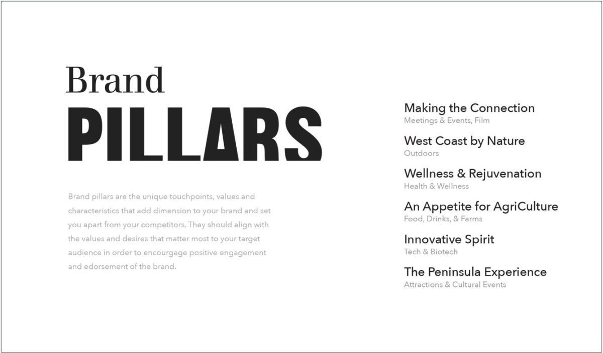
The San Francisco Peninsula ...
- Believes in the magic of meeting in person. Making the Connection.
- Has wide-open spaces of ancient redwoods, wild and rugged coastlines, and diverse wildlife setting the stage to experience life at nature’s pace. West Coast By Nature.
- Offers opportunities to connect with mind, body, and spirit abound for everyone. Wellness & Rejuvenation.
- Has An Appetite for AgriCulture, serving up big-city options in a down-to-earth setting, sourcing local goods sustainably, whether pulled from the ocean or picked from local farms.
- Serves as a playground to brilliant outliers and free-thinkers whose pioneering spirit cultivates new horizons for travel, technology, biotech, and beyond. Innovative Spirit.
- The Peninsula Experience delights all your senses and leaves you wanting more
Personality, Tone of Voice & Brand Story
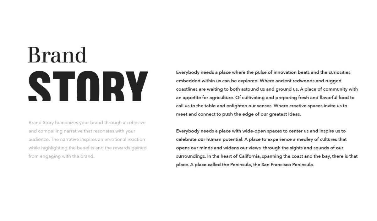
With the pillars identified, the area’s unique personality was starting to reveal itself — curious, relaxed, enterprising, tasteful, and natural. That personality then became a compass for the “tone of voice” that marketers should use when promoting the region. Professional, yet spirited. Conversational and inviting rather than formal.
Graphic Standards Inspire a Mood
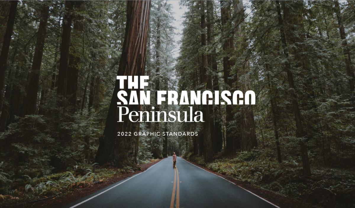
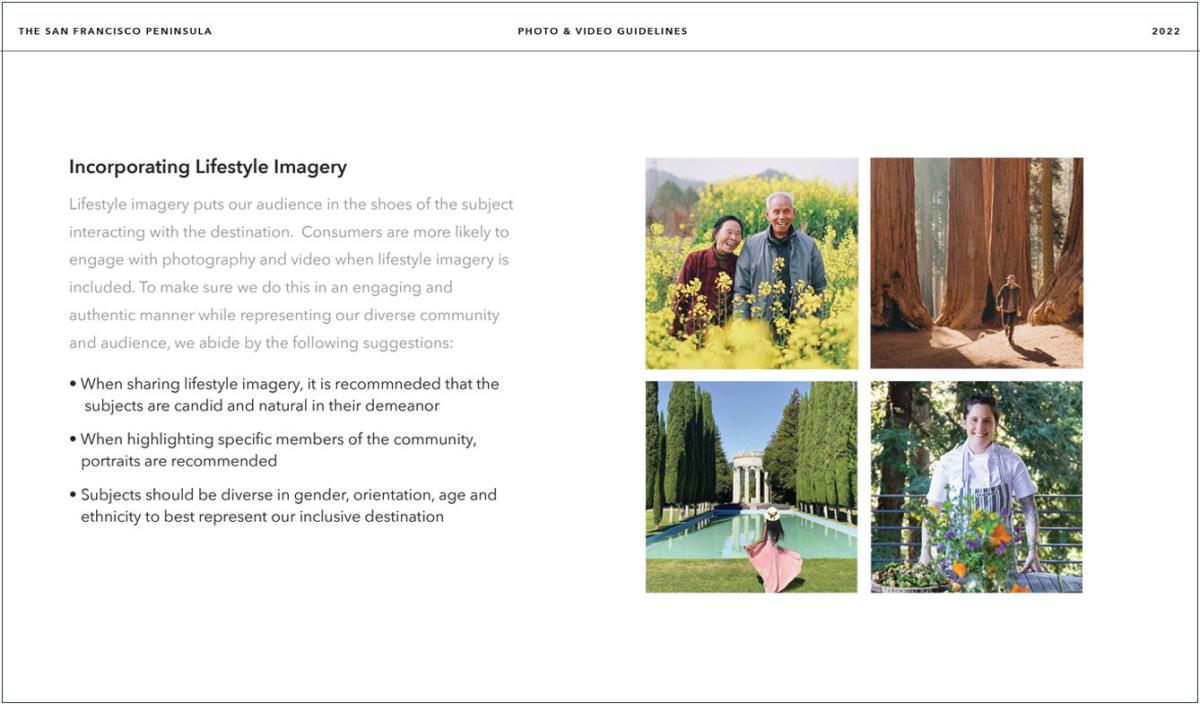
If brand ethos is the “feeling” of a place, then graphic standards are a visual interpretation of those feelings. They define the look and feel of the brand through color, typography, and imagery.
Each element works together to make the brand cohesive, engaging, and unique. The graphic standards are really rules instructing how to use each element properly when developing marketing materials.
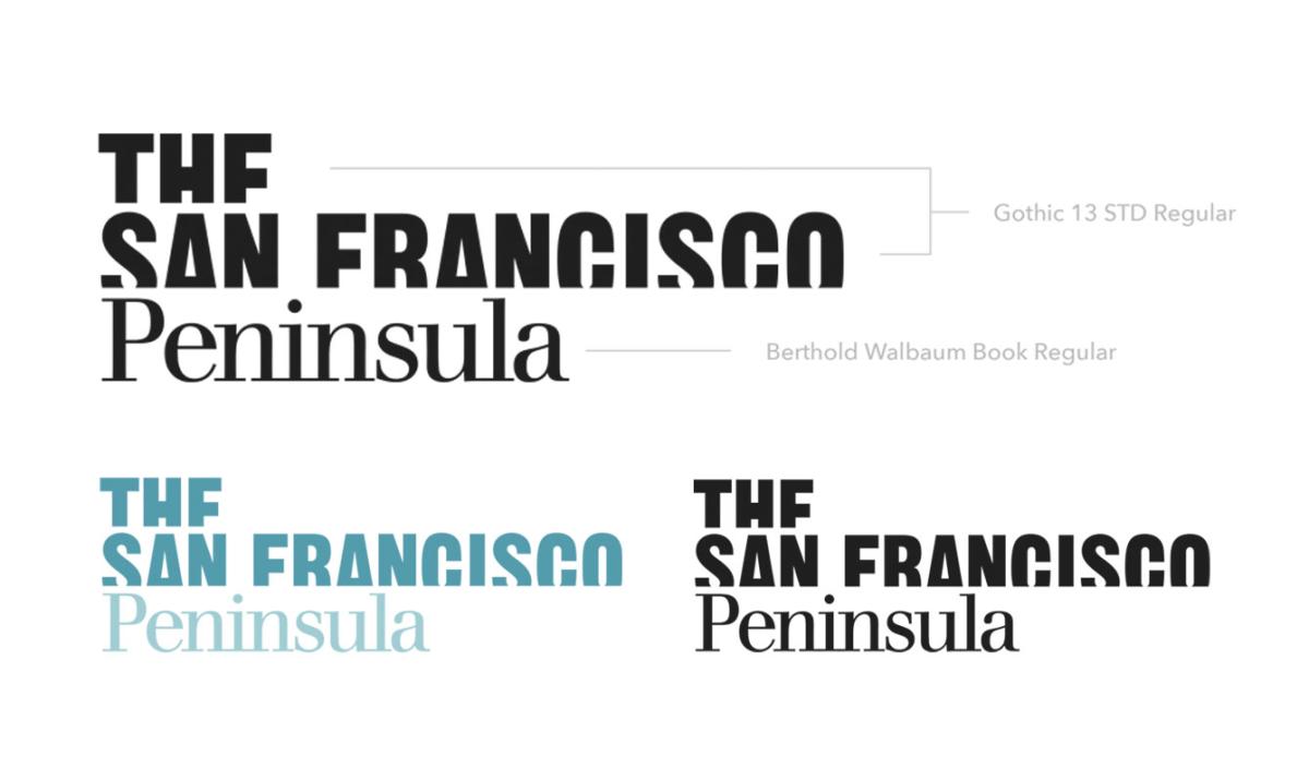
A Logo to Celebrate & Anchor The Peninsula
The main challenge of the logo design centered around using “San Francisco” in the name while wanting to diminish it as well.
The elimination of the bleeding edge of “San Francisco” left space for “Peninsula” to stand independent, clear, and true. Visually, San Francisco comes out of the Peninsula, not the other way around. There is no San Francisco without the Peninsula. The story the logo tells is that the vibe of San Francisco is on the horizon and comes out of the Peninsula, but there is more to discover. The Peninsula is in the foreground and in full glory, ready to be experienced and celebrated.
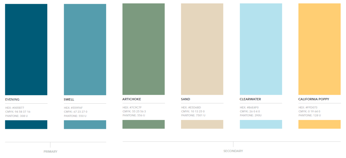
From Personality Comes Color & Mood
A Color Palette to Set the Tone
Continuing with the compass provided by the personality — curious, relaxed, enterprising, tasteful, and natural — the XD team understood the color palette shouldn’t be too buttoned up. The area’s vibe is not business-suit blue. Inspiration visits when people feel relaxed and welcome, so the colors had to feel that way. And since the natural setting is such a big part of what makes The San Francisco Peninsula unique, the colors needed to reflect that. Blue for water, green for grass and forest. Heck, even the color names of “Sand,” “Clearwater,” and “California Poppy” speak to the peninsula’s vibe and personality.
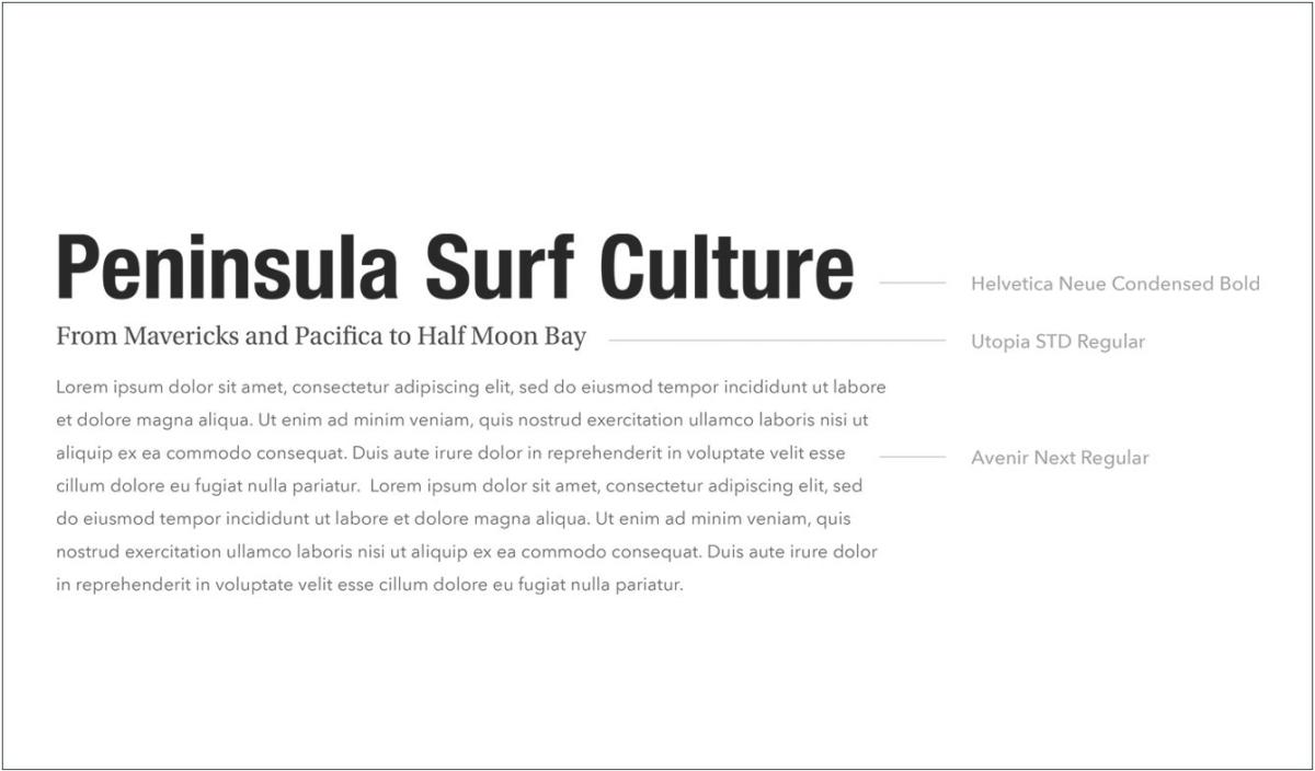
Topping it Off with Typography
In destination branding, every decision is deliberate. The Simpleview XD team has two typography rules it refuses to break:

When choosing editorial fonts, the goal was for them to be tasteful, a bit sophisticated, and compatible with the logo fonts.

Legibility overrides everything when choosing editorial fonts: if you’re putting words on the website, you want people to read them—there’s no room for clutter simply for the sake of cleverness.
Logo fonts and editorial fonts have two different purposes, and never the two shall mix.
An Authentic Identity Emerges
What started as the hard-to-place San Mateo County/Silicon Valley Convention and Visitors Bureau evolved into a destination with a personality unlike any other.
The new brand came about through design creativity grounded in the discipline of data. It forever puts to rest the question, “San Mateo — where’s that?”
Now we know. It’s South of San Francisco, North of Expectations.

Need help telling your destination’s story?
Give your destination the visual identity it deserves. Greet and inspire visitors, attendees, and partners with an evoking identity through branding and design.
Let's Talk Design
