First-time visitors to Austin might be surprised to find themselves being entertained with live music as they walk through the terminal at Austin-Bergstrom International Airport after deplaning. But in actuality, it’s probably the most on-brand welcome the city could offer.
Dubbed ‘The Live Music Capital of the World®,’ Austin is home to more than 250 live music venues throughout the city. Visitors can expect to see – and hear – musicians in typical venues such as clubs, coffeehouses, bars and concert halls, as well in unexpected places like grocery stores and city council meetings.
When it came time for the team at Visit Austin to redesign their website, it was this energy and personality they wanted the new site to convey. The design needed to not only communicate Austin’s love for live music, but even more so - the fact Austin is a culturally rich destination with diverse offerings for every kind of traveler.

Hit the Refresh Button
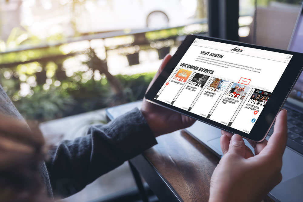
With the redesign, Visit Austin wanted a clean, striking design that featured eye-catching visuals. And while their previous site had plenty of engaging content, it could be difficult for the user to navigate the site to find what they were looking for. As a result, the Simpleview XD team focused on putting content first and using website data to make the user experience more intuitive and interactive.
Overall, the site needed to exude a certain “coolness” factor that might help to negate preconceived notions and stereotypes of Texas from first-time visitors. Austin isn’t just tumbleweeds and dude ranches; it’s a cool, urban destination with a rich and diverse culture.
Award Worthy
Since its launch in April 2018, the website has seen impressive metrics and has been recognized with a Silver Award in the Digital Marketing Website category for the 2019 HSMAI Adrian Awards.
Beauty is in the Ear of the Beholder
As the Simpleview XD team set to work, they focused on highlighting a few of Austin’s key characteristics: its foodie scene, outdoor offerings and status as The Live Music Capital of the World.® These are the things that set Austin apart from other destinations, including those in Texas; it was important to the team to incorporate these elements into the final design.
They did so in obvious ways, such as adding a “Music Scene” tab to the navigation bar, and in more subtle ways, by incorporating a grooved texture into the site background, designed to mimic the grooves on a record.
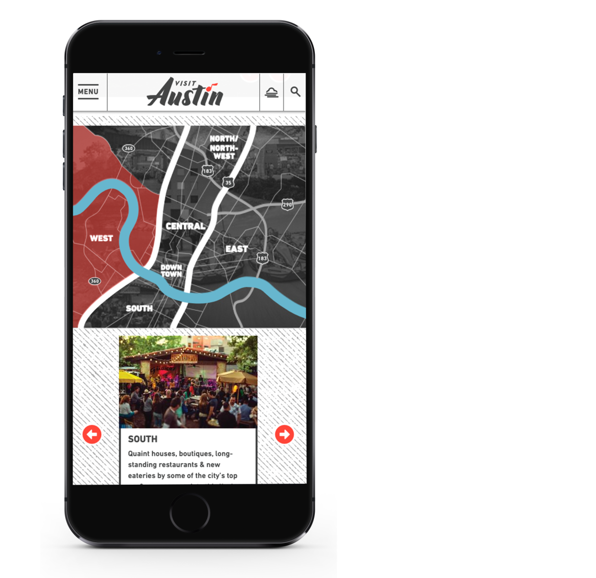
The one-column, mobile-first site also showcased full-width videos and user-generated content (UGC) from visitors, creating visual storytelling elements that encourage visitors to picture themselves in the destination. In addition, features such as fully customizable listings pages and a mobile navigation menu set the site apart from other destination websites and enhanced the user experience.
Going forward, the team at Visit Austin is placing an emphasis on increasing engagement metrics such as time on site and pages per visit. In doing so, they’ve prioritized the integration of video assets and user-generated content into the site, and made sure that editorial content is easier for users to find and consume.
Touch, Click and Scroll
Did you know that every year, nearly 400 million people touch, click, swipe and scroll their way through websites and apps designed by Simpleview? Click the button below, and we'll show what the hype is all about.
Get My Free Design Consultation

