The Las Vegas Convention and Visitors Authority (LVCVA) is the official destination marketing organization (DMO) of Southern Nevada — responsible for attracting visitors by promoting Las Vegas as the world's most desirable destination for leisure and business travel.
Las Vegas has always been a larger-than-life pioneer of entertainment and world-class experience. The LVCVA brand was designed for spontaneous explorers — those who want to escape rut and routine and embrace the lights and loudness of a city that calls for celebration.
With a constant slew of online visitors looking for information, the LVCVA strove to establish its website as the real-time voice and trusted authority on all things Las Vegas. The LVCVA called on Simpleview to create a design strategy for the new VisitLasVegas.com, with an emphasis on building brand equity by increasing content quantity, quality, and user experience.
Before we dive in, here is why we are bragging about this. Since the launch of the redesign on January 12, 2023, the site reported the following key results:
- Sessions increased by 151%
- Pageviews increased by 53%
- Paid search increased by 488%
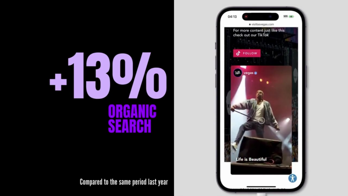
- Organic search increased by 13%
- Direct traffic increased by 64%
- Referral traffic increased by 112%
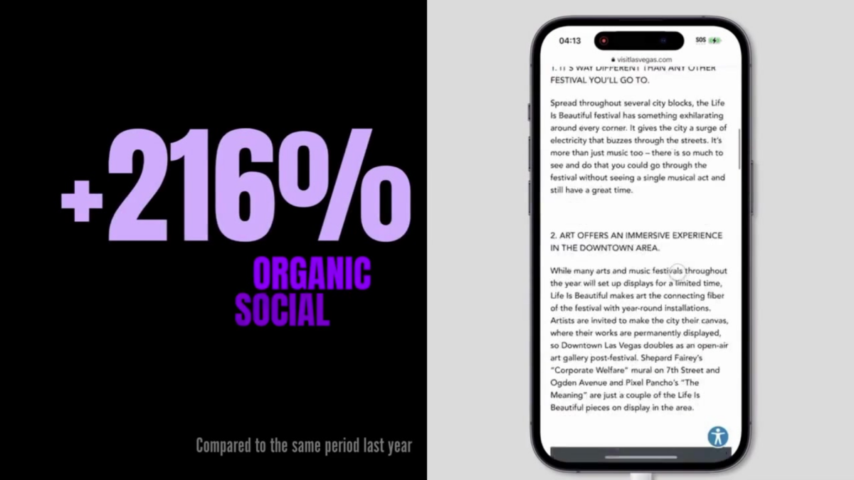
- Organic social increased by 215%

Goals (Spoiler Alert: We Met Them)
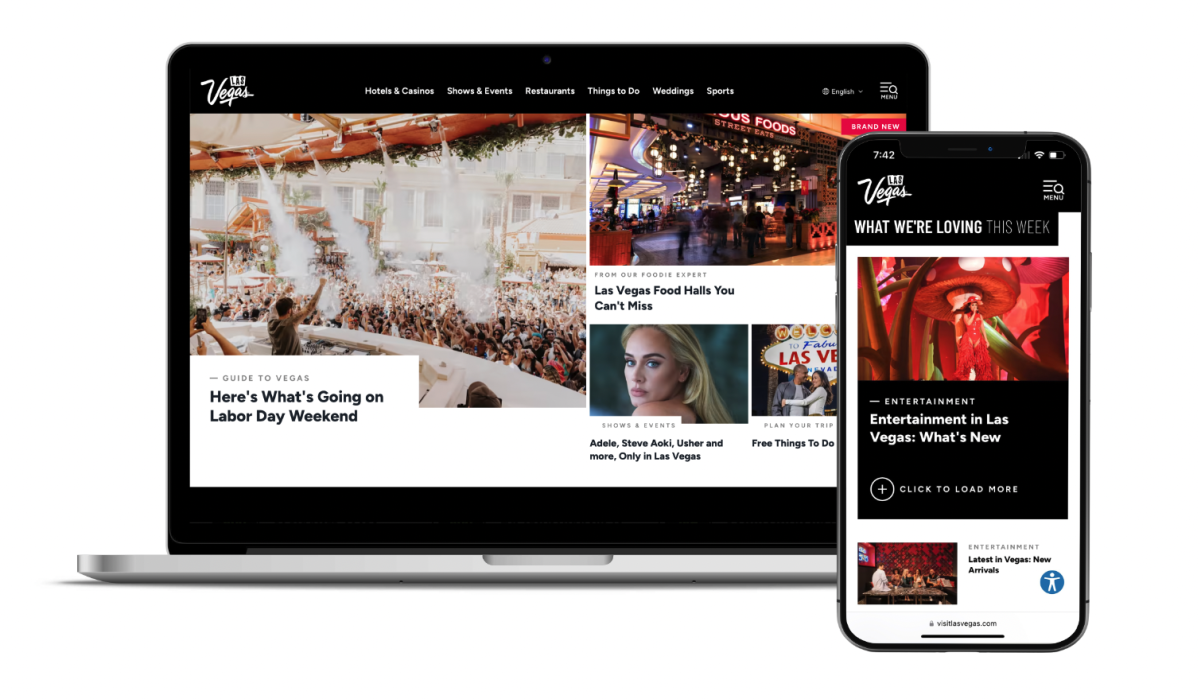
Prior to this project, it had been five years since the last redesign — and aesthetically, the old website was underwhelming. Its clunky navigation overshadowed the fun, fresh personality of modern Las Vegas, where there is always something new to explore. Keeping in mind that four out of five visitors to Las Vegas are returning rather than first-timers, Simpleview was asked to design a website that would continually offer compelling, consistent content (particularly on the homepage) to serve as the go-to source for information on the latest happenings for the destination’s loyal fanbase.
The overarching website redesign goals were to:
- Modernize user experience (UX) to adapt to today’s consumer
- Build site navigation around modularity and flexibility to allow for seamless editing, page builds, and real-time optimization
- Focus on content curation and partner referrals
- Create a smooth digital experience from social to the web
- Develop custom solutions to enhance content experience and repurpose the most engaging social media assets
- Optimize A/B testing capabilities to make data-driven decisions for the future of the site

How #OnlyVegas Was Born
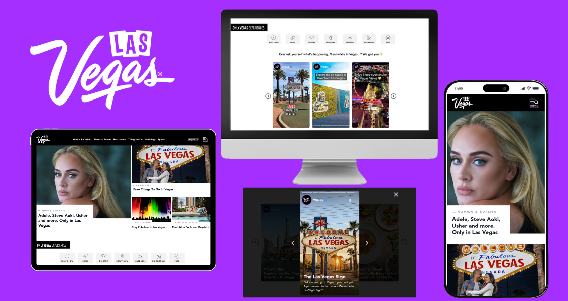
To enhance user experience, Simpleview experts designed the website with mobile-first optimization. It included a full aesthetic redesign and the creation of a modernized navigation bar. Screen real estate was carefully considered within the sizing of collections and how they respond to the browser size. In turn, a well-layered visual hierarchy of all breakpoints was employed.
A new color strategy and comprehensive navigation strategy were also implemented. Purple is used for hovers and important buttons, and red signifies everything current, brand new, and social media-related. These vibrant colors combined with the flexible navigation ensure a dynamic user experience and a more controlled user flow. The eye-catching iconography drives users to the most popular content and requires less screen space.
To increase qualified leads, site visitors are provided with the relevant data points early in their user journey. After research and comparison to larger competitors in the space, booking/conversion data was analyzed to determine which data points were required by users to make a decision. Each listing category displays information relevant to the category type, which is intended to give the user all the relevant data points needed to make a decision to click through to the partner’s website or detail page.
LVCVA’s index pages were strategically pushed down further in the site map, as it was determined that users don't often use filter functionality on the index pages — leading to less direction in their search and more unqualified leads. Instead of going straight to the index pages for hotels, restaurants, or events, users first see a curated page where listings are separated out and essentially prefiltered by popular category and amenities. This allows the user to have more intent in their search without filtering. This approach is an innovative way of displaying information from databases to front-end users.


So… Why Are We Bragging About This?
The LVCVA team reported that engaged sessions from social media increased by 213.59% and that the site also saw an uptick in mobile traffic, with an increase of 145.38% in users and 47.95% in engaged sessions.
A post-launch analysis was conducted for VisitLasVegas.com comparing metrics 12 weeks before the launch date to 12 weeks after. The expanded sitemap saw promising results with the top new pages seeing thousands of sessions only 12 weeks after launch. The blogs, sports, weddings, and culture sections of the site performed well, with all blog pages gathering 336,445 organic sessions (+30.23%). Furthermore, the homepage saw an improvement of 30.83% in organic sessions.
The redesigned VisitLasVegas.com showcases a world-class destination’s unique personality with thoughtful, intriguing design elements combined with intuitive navigation resulting in improved aesthetics and conversion rates. The site anticipates users’ wants and needs — it inspires prospective visitors to plan their trip while informing travelers in-market about the latest and greatest things to do.


Bonus!
Visit Las Vegas is also the number one most followed destination worldwide on TikTok, so LVCVA’s most engaged social media assets were integrated into the website to create an effortless mobile screen experience to navigate from app to browser and vice versa. Simpleview developed a stories widget and vertical video integrations, both custom solutions for VisitLasVegas.com, to allow the LVCVA team to create and display stories on their site just like they would on Instagram. This enables LVCVA to not only reuse its social assets but display visual and written content in a completely new and engaging format. Since TikTok does not allow content to feed back to VisitLasVegas.com via API, Simpleview created a widget that plays and functions to match the vertical story aesthetic (IG Reels, TikTok).
The redesigned VisitLasVegas.com successfully captures the essence of Las Vegas, and the website’s modernized user experience, mobile-first optimization, and intuitive navigation have greatly improved aesthetics and conversion rates, leading to impressive results.
Need help telling your destination’s story?
Greet and inspire visitors, attendees, and partners with an evoking identity through branding and design.
Let's talk design
